今回は Chart.js を使ってグラフを描画するコードの解説していきます。作成するグラフは特に思いつかなかったので、公式サイトのサンプル通りのデータでグラフを作っていきます。
完成しているコードは下記にあります。
環境
- node: 18.20.0
- Angular CLI:17.0.0
- Chart.js:4.4.5
- ng2-charts:6.0.1
プロジェクトの作成
$ ng new chartパッケージのインストール
$ npm install chart.js ng2-chartsライブラリは Chart.js と ng2-charts を使用します。 ng2-charts は簡単に言えば Angular で簡単に Chart.js を使用できるようにするモジュールです。
モジュールの生成
$ ng generate module modules/chartimport { NgModule } from '@angular/core';
import { CommonModule } from '@angular/common';
import { provideCharts, withDefaultRegisterables, } from 'ng2-charts';
@NgModule({
declarations: [],
imports: [
CommonModule,
],
providers: [
provideCharts(withDefaultRegisterables()),
]
})
export class ChartModule { }公式では main.ts に ng2-charts の設定をする方法を紹介していますが、今回は専用のモジュールを作成して設定をしています。好きな方法で設定してください。
棒グラフ
A bar chart provides a way of showing data values represented as vertical bars. It is sometimes used to show trend data, and the comparison of multiple data sets side by side.
https://www.chartjs.org/docs/latest/charts/bar.html
コンポーネントの生成
$ ng generate component component/page/bar-chart<canvas baseChart [datasets]="dataset" [labels]="labels" [options]="options" [plugins]="plugins" [legend]="legend"
[type]="type">
</canvas>- datasets・・・データーセットを設定します。
- labels・・・グラフのデータセットに対応するラベルを設定します。
- options・・・オプションを設定します。
- plugins・・・プラグインを設定します。
- legend・・・凡例の表示について設定します。
- type・・・「bar」や「line」など、グラフの種類を設定します。
HTMLはすべてのグラフで同じコードですので以降は記載しません。
import { Component } from '@angular/core';
import { ChartOptions, ChartType, ChartDataset } from 'chart.js';
import { BaseChartDirective } from 'ng2-charts';
import { ChartModule } from '../../../modules/chart/chart.module';
@Component({
selector: 'app-bar-chart',
standalone: true,
imports: [BaseChartDirective, ChartModule],
templateUrl: './bar-chart.component.html',
styleUrl: './bar-chart.component.css'
})
export class BarChartComponent {
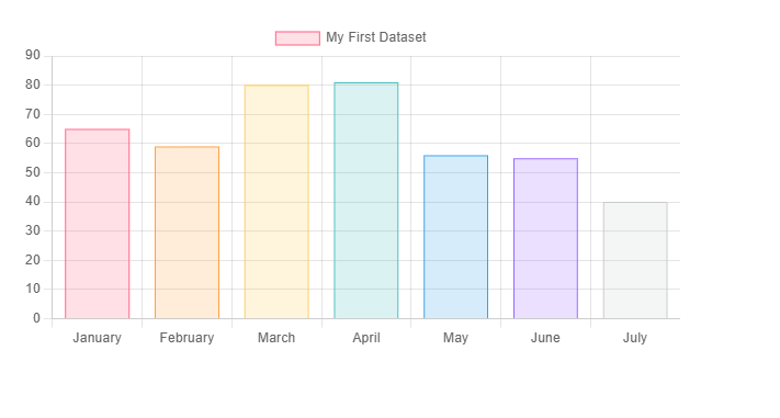
dataset: ChartDataset[] = [{
label: 'My First Dataset',
data: [65, 59, 80, 81, 56, 55, 40],
backgroundColor: [
'rgba(255, 99, 132, 0.2)',
'rgba(255, 159, 64, 0.2)',
'rgba(255, 205, 86, 0.2)',
'rgba(75, 192, 192, 0.2)',
'rgba(54, 162, 235, 0.2)',
'rgba(153, 102, 255, 0.2)',
'rgba(201, 203, 207, 0.2)'
],
borderColor: [
'rgb(255, 99, 132)',
'rgb(255, 159, 64)',
'rgb(255, 205, 86)',
'rgb(75, 192, 192)',
'rgb(54, 162, 235)',
'rgb(153, 102, 255)',
'rgb(201, 203, 207)'
],
borderWidth: 1
}];
labels: string[] = [
'January',
'February',
'March',
'April',
'May',
'June',
'July'
];
options: ChartOptions = {
responsive: true,
scales: {
y: {
beginAtZero: true
}
}
};
plugins = [];
legend = true;
type: ChartType = 'bar';
}
バブルチャート
A bubble chart is used to display three dimensions of data at the same time. The location of the bubble is determined by the first two dimensions and the corresponding horizontal and vertical axes. The third dimension is represented by the size of the individual bubbles.
https://www.chartjs.org/docs/latest/charts/bubble.html
コンポーネントの生成
$ ng generate component component/page/bubble-chartimport { Component } from '@angular/core';
import { ChartOptions, ChartType, ChartDataset } from 'chart.js';
import { BaseChartDirective } from 'ng2-charts';
import { ChartModule } from '../../../modules/chart/chart.module';
@Component({
selector: 'app-bubble-chart',
standalone: true,
imports: [BaseChartDirective, ChartModule],
templateUrl: './bubble-chart.component.html',
styleUrl: './bubble-chart.component.css'
})
export class BubbleChartComponent {
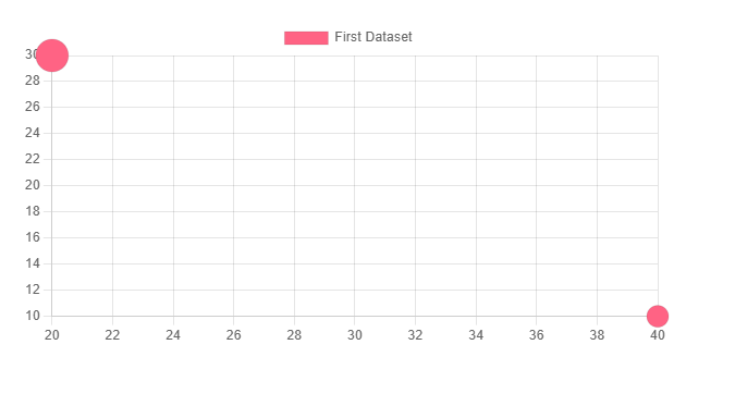
dataset: ChartDataset[] = [{
label: 'First Dataset',
data: [{
x: 20,
y: 30,
r: 15
}, {
x: 40,
y: 10,
r: 10
}],
backgroundColor: 'rgb(255, 99, 132)'
}];
labels: string[] = [
'Eating',
'Drinking',
'Sleeping',
'Designing',
'Coding',
'Cycling',
'Running'
];
options: ChartOptions = {
responsive: true,
};
plugins = [];
legend = true;
type: ChartType = 'bubble';
}
ドーナツグラフ
Pie and doughnut charts are probably the most commonly used charts. They are divided into segments, the arc of each segment shows the proportional value of each piece of data.
https://www.chartjs.org/docs/latest/charts/doughnut.html
コンポーネントの生成
$ ng generate component component/page/doughnut-chartimport { Component } from '@angular/core';
import { ChartOptions, ChartType, ChartDataset } from 'chart.js';
import { BaseChartDirective } from 'ng2-charts';
import { ChartModule } from '../../../modules/chart/chart.module';
@Component({
selector: 'app-doughnut-chart',
standalone: true,
imports: [BaseChartDirective, ChartModule],
templateUrl: './doughnut-chart.component.html',
styleUrl: './doughnut-chart.component.css'
})
export class DoughnutChartComponent {
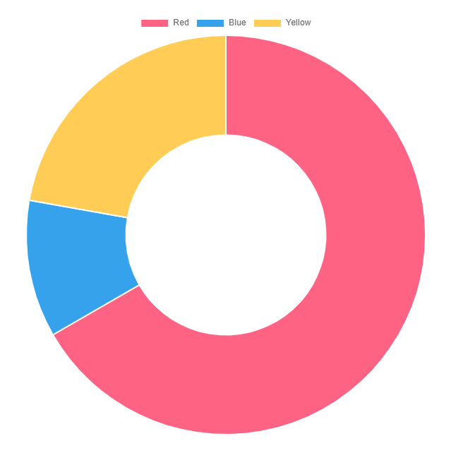
dataset: ChartDataset[] = [{
label: 'My First Dataset',
data: [300, 50, 100],
backgroundColor: [
'rgb(255, 99, 132)',
'rgb(54, 162, 235)',
'rgb(255, 205, 86)'
],
hoverOffset: 4
}];
labels: string[] = [
'Red',
'Blue',
'Yellow'
];
options: ChartOptions = {
responsive: true,
};
plugins = [];
legend = true;
type: ChartType = 'doughnut';
}
円グラフ
コンポーネントの生成
$ ng generate component component/page/pie-chartimport { Component } from '@angular/core';
import { ChartOptions, ChartType, ChartDataset } from 'chart.js';
import { BaseChartDirective } from 'ng2-charts';
import { ChartModule } from '../../../modules/chart/chart.module';
@Component({
selector: 'app-pie-chart',
standalone: true,
imports: [BaseChartDirective, ChartModule],
templateUrl: './pie-chart.component.html',
styleUrl: './pie-chart.component.css'
})
export class PieChartComponent {
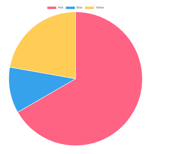
dataset: ChartDataset[] = [{
label: 'My First Dataset',
data: [300, 50, 100],
backgroundColor: [
'rgb(255, 99, 132)',
'rgb(54, 162, 235)',
'rgb(255, 205, 86)'
],
hoverOffset: 4
}];
labels: string[] = [
'Red',
'Blue',
'Yellow'
];
options: ChartOptions = {
responsive: true,
};
plugins = [];
legend = true;
type: ChartType = 'pie';
}
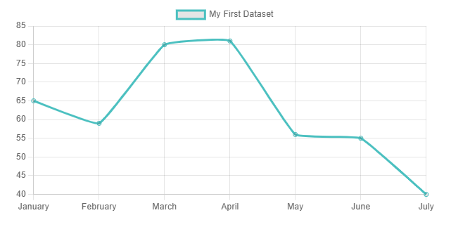
折れ線グラフ
A line chart is a way of plotting data points on a line. Often, it is used to show trend data, or the comparison of two data sets.
https://www.chartjs.org/docs/latest/charts/line.html
コンポーネントの生成
$ ng generate component component/page/line-chartimport { Component } from '@angular/core';
import { ChartOptions, ChartType, ChartDataset } from 'chart.js';
import { BaseChartDirective } from 'ng2-charts';
import { ChartModule } from '../../../modules/chart/chart.module';
@Component({
selector: 'app-line-chart',
standalone: true,
imports: [BaseChartDirective, ChartModule],
templateUrl: './line-chart.component.html',
styleUrl: './line-chart.component.css'
})
export class LineChartComponent {
dataset: ChartDataset[] = [{
label: 'My First Dataset',
data: [65, 59, 80, 81, 56, 55, 40],
fill: false,
borderColor: 'rgb(75, 192, 192)',
tension: 0.1
}];
labels: string[] = [
'January',
'February',
'March',
'April',
'May',
'June',
'July'
];
options: ChartOptions = {
responsive: true,
};
plugins = [];
legend = true;
type: ChartType = 'line';
}
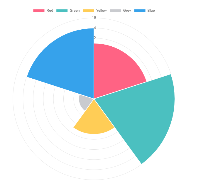
鶏頭図
Polar area charts are similar to pie charts, but each segment has the same angle – the radius of the segment differs depending on the value.
https://www.chartjs.org/docs/latest/charts/polar.html
This type of chart is often useful when we want to show a comparison data similar to a pie chart, but also show a scale of values for context.
コンポーネントの生成
$ ng generate component component/page/polar-area-chartimport { Component } from '@angular/core';
import { ChartOptions, ChartType, ChartDataset } from 'chart.js';
import { BaseChartDirective } from 'ng2-charts';
import { ChartModule } from '../../../modules/chart/chart.module';
@Component({
selector: 'app-polar-area-chart',
standalone: true,
imports: [BaseChartDirective, ChartModule],
templateUrl: './polar-area-chart.component.html',
styleUrl: './polar-area-chart.component.css'
})
export class PolarAreaChartComponent {
dataset: ChartDataset[] = [{
label: 'My First Dataset',
data: [11, 16, 7, 3, 14],
backgroundColor: [
'rgb(255, 99, 132)',
'rgb(75, 192, 192)',
'rgb(255, 205, 86)',
'rgb(201, 203, 207)',
'rgb(54, 162, 235)'
]
}];
labels: string[] = [
'Red',
'Green',
'Yellow',
'Grey',
'Blue'
];
options: ChartOptions = {
responsive: true,
};
plugins = [];
legend = true;
type: ChartType = 'polarArea';
}
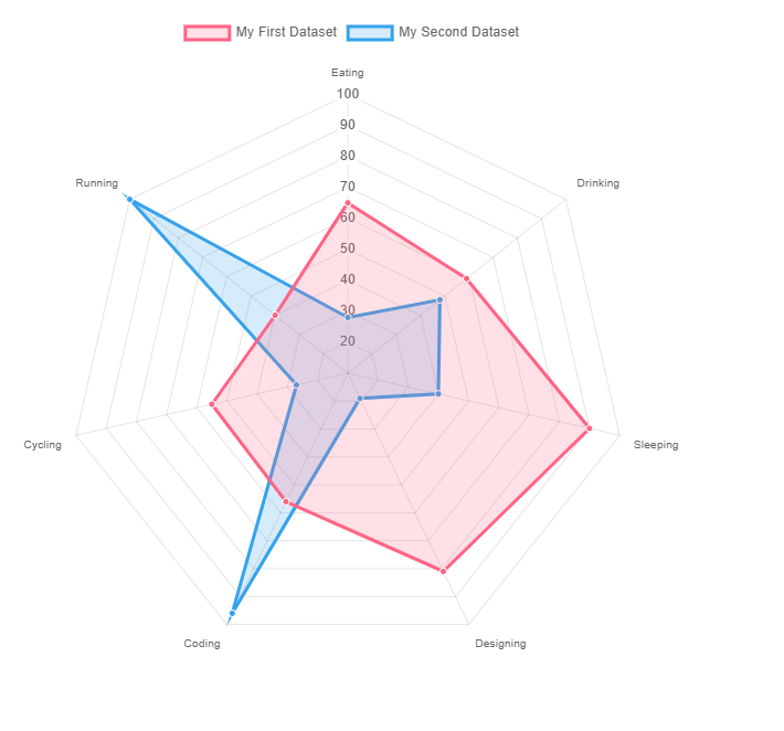
レーダーチャート
A radar chart is a way of showing multiple data points and the variation between them.
https://www.chartjs.org/docs/latest/charts/radar.html
They are often useful for comparing the points of two or more different data sets.
コンポーネントの生成
$ ng generate component component/page/radar-chartimport { Component } from '@angular/core';
import { ChartOptions, ChartType, ChartDataset } from 'chart.js';
import { BaseChartDirective } from 'ng2-charts';
import { ChartModule } from '../../../modules/chart/chart.module';
@Component({
selector: 'app-radar-chart',
standalone: true,
imports: [BaseChartDirective, ChartModule],
templateUrl: './radar-chart.component.html',
styleUrl: './radar-chart.component.css'
})
export class RadarChartComponent {
dataset: ChartDataset[] = [{
label: 'My First Dataset',
data: [65, 59, 90, 81, 56, 55, 40],
fill: true,
backgroundColor: 'rgba(255, 99, 132, 0.2)',
borderColor: 'rgb(255, 99, 132)',
pointBackgroundColor: 'rgb(255, 99, 132)',
pointBorderColor: '#fff',
pointHoverBackgroundColor: '#fff',
pointHoverBorderColor: 'rgb(255, 99, 132)'
}, {
label: 'My Second Dataset',
data: [28, 48, 40, 19, 96, 27, 100],
fill: true,
backgroundColor: 'rgba(54, 162, 235, 0.2)',
borderColor: 'rgb(54, 162, 235)',
pointBackgroundColor: 'rgb(54, 162, 235)',
pointBorderColor: '#fff',
pointHoverBackgroundColor: '#fff',
pointHoverBorderColor: 'rgb(54, 162, 235)'
}];
labels: string[] = [
'Eating',
'Drinking',
'Sleeping',
'Designing',
'Coding',
'Cycling',
'Running'
];
options: ChartOptions = {
responsive: true,
elements: {
line: {
borderWidth: 3
}
}
};
plugins = [];
legend = true;
type: ChartType = 'radar';
}
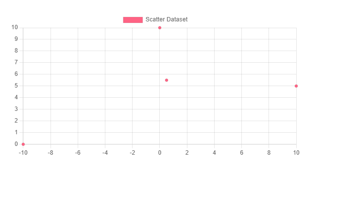
散布図
Scatter charts are based on basic line charts with the x-axis changed to a linear axis. To use a scatter chart, data must be passed as objects containing X and Y properties. The example below creates a scatter chart with 4 points.
https://www.chartjs.org/docs/latest/charts/scatter.html
コンポーネントの生成
$ ng generate component component/page/scatter-chartimport { Component } from '@angular/core';
import { ChartOptions, ChartType, ChartDataset } from 'chart.js';
import { BaseChartDirective } from 'ng2-charts';
import { ChartModule } from '../../../modules/chart/chart.module';
@Component({
selector: 'app-scatter-chart',
standalone: true,
imports: [BaseChartDirective, ChartModule],
templateUrl: './scatter-chart.component.html',
styleUrl: './scatter-chart.component.css'
})
export class ScatterChartComponent {
dataset: ChartDataset[] = [{
label: 'Scatter Dataset',
data: [{
x: -10,
y: 0
}, {
x: 0,
y: 10
}, {
x: 10,
y: 5
}, {
x: 0.5,
y: 5.5
}],
backgroundColor: 'rgb(255, 99, 132)'
}];
labels: string[] = [];
options: ChartOptions = {
responsive: true,
scales: {
x: {
type: 'linear',
position: 'bottom'
}
}
};
plugins = [];
legend = true;
type: ChartType = 'scatter';
}


コメント